Speed is a major contributor to user experience on modern web sites.
It is important to pay attention not only to technologies that said experiences are build with, but to the way they are designed as well.
Proper speed design is a collaboration between product managers, UI designers and developers as all the aspects of the page composition must be balanced to achieve fast experience that is useful for end-users and deliver on the goals set by creators of the site.
Below is the list of common speed design problems and their design solutions. We try not to concentrate on specific technical implementations or specific types of sites so it can be used in any context.
Fast Start
Before user can start the experience, there is an inevitable delay as user's browser goes away from previous view to the current view.

Immutable Layout
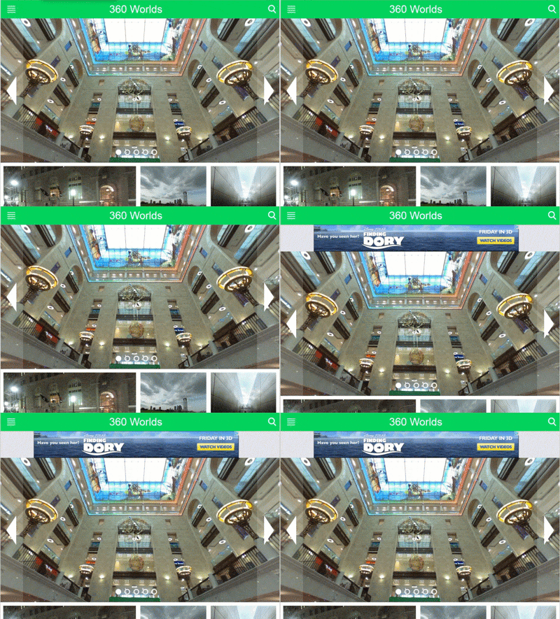
A common problem on web sites that use ads or other 3rd party display elements (widgets), but also manifests in regular websites is change in layout as page loads.
This is particularly noticeable by users when they start scrolling down the page and element at the top of the page (e.g. ad banner or carousel image that finally loaded) suddenly changes it's height pushing content down.

Skeletal Designs
Technique introduced by Luke Wroblewsky and used by many sites, including Facebook's and LinkedIn's newsfeeds can be utilized to indicate progress and provide visual cue to what user should expect reducing cognitive load and user's frustration.
Contributing
Help us add more patterns!
Submit new patterns to the issue tracker, help existing submissions by collecting articles and examples of implementation.
See Contribution Guide on our GitHub repo.